The navigation bar is usually placed at the top of the page.
We can use it.
.navbar
class to create a standard navigation bar, followed by:
.navbar-expand-xxl|xl|lg|md|sm
class to create a responsive navigation bar (large screens spread horizontally and small screens stack vertically).
The options on the navigation bar can be used By deleting By adding You can use the following classes to create different colored navigation bars: Tip: for dark background Activate and disable states: can be found in the Can be used Usually, we collapse the navigation bar on the small screen and click to display the navigation options. To create a collapsible navigation bar, you can add Drop-down menus can be set on the navigation bar: The form of the navigation bar You can also use other input box classes, such as Use The navigation bar can be fixed at the head or bottom. We use
<ul>
element and add
class="navbar-nav"
class. And then in
<li>
add on the element
.nav-item
class
<a>
element using the
.nav-link
class: 7.22.1. Example 
<!-- The horizontal navigation bar on the small screen will switch to vertical -->
<nav class="navbar navbar-expand-sm bg-light">

  <!-- Links -->
  <ul class="navbar-nav">
    <li class="nav-item">
      <a class="nav-link" href="#">Link 1</a>
    </li>
    <li class="nav-item">
      <a class="nav-link" href="#">Link 2</a>
    </li>
    <li class="nav-item">
      <a class="nav-link" href="#">Link 3</a>
    </li>
  </ul>

</nav>
Vertical navigation bar 
.navbar-expand-xxl|xl|lg|md|sm
class to create a vertical navigation bar: 7.22.2. Example 
<!-- Vertical navigation bar -->
<nav class="navbar bg-light">

  <!-- Links -->
  <ul class="navbar-nav">
    <li class="nav-item">
      <a class="nav-link" href="#">Link 1</a>
    </li>
    <li class="nav-item">
      <a class="nav-link" href="#">Link 2</a>
    </li>
    <li class="nav-item">
      <a class="nav-link" href="#">Link 3</a>
    </li>
  </ul>

</nav>
Center-aligned navigation bar 
.justify-content-center
class to create a center-aligned navigation bar 7.22.3. Example 
<nav class="navbar navbar-expand-sm bg-light justify-content-center">
  ...
</nav>
Different color navigation bar 
.bg-primary
,
.bg-success
,
.bg-info
,
       .bg-
       warning
,
.bg-danger
,
.bg-secondary
,
.bg-dark
and
       .bg-
       light
).
.navbar-dark
need to set the text color to light, for light background
.navbar-light
you need to set the text color to dark. 7.22.4. Example 
<!-- Grey background with black letters -->
<nav class="navbar navbar-expand-sm bg-light navbar-light">
  <ul class="navbar-nav">
    <li class="nav-item active">
      <a class="nav-link" href="#">Active</a>
    </li>
    <li class="nav-item">
      <a class="nav-link" href="#">Link</a>
    </li>
    <li class="nav-item">
      <a class="nav-link" href="#">Link</a>
    </li>
    <li class="nav-item">
      <a class="nav-link disabled" href="#">Disabled</a>
    </li>
  </ul>
</nav>

<!-- White on Black -->
<nav class="navbar navbar-expand-sm bg-dark navbar-dark">...</nav>

<!-- Blue background with white characters -->
<nav class="navbar navbar-expand-sm bg-primary navbar-dark">...</nav>
<a>
add on the element``.active`` Cclass to highlight the selected options.
.disabled
class to set that the link is unclickable.Brand / Logo 
.navbar-brand
class is used to highlight brand / Logo: 7.22.5. Example 
<nav class="navbar navbar-expand-sm bg-dark navbar-dark">
  <a class="navbar-brand" href="#">Logo</a>
  ...
</nav>
.navbar-brand
class to set the picture adaptive navigation bar. 7.22.6. Example 
<nav class="navbar navbar-expand-sm bg-dark navbar-dark">
   <a class="navbar-brand" href="#">
    <img src="bird.jpg" alt="Logo" style="width:40px;">
  </a>
  ...
</nav>
Collapse the navigation bar 
class="navbar-toggler"
,
       data-bs-
       toggle="collapse"
and
       data-target="#
       thetarget"
class. Then, after setting up the
       class="collapse
       navbar-collapse"
class
div
the navigation content (link) on the package, the``div`` element,the id specified on the
data-target
button for ID: matching: 7.22.7. Example 
<nav class="navbar navbar-expand-md bg-dark navbar-dark">
  <!-- Brand -->
  <a class="navbar-brand" href="#">Navbar</a>

  <!-- Toggler/collapsibe Button -->
  <button class="navbar-toggler" type="button" data-bs-toggle="collapse" data-bs-target="#collapsibleNavbar">
    <span class="navbar-toggler-icon"></span>
  </button>

  <!-- Navbar links -->
  <div class="collapse navbar-collapse" id="collapsibleNavbar">
    <ul class="navbar-nav">
      <li class="nav-item">
        <a class="nav-link" href="#">Link</a>
      </li>
      <li class="nav-item">
        <a class="nav-link" href="#">Link</a>
      </li>
      <li class="nav-item">
        <a class="nav-link" href="#">Link</a>
      </li>
    </ul>
  </div>
</nav>
The navigation bar uses the drop-down menu 
7.22.8. Example 
<nav class="navbar navbar-expand-sm bg-dark navbar-dark">
  <!-- Brand -->
  <a class="navbar-brand" href="#">Logo</a>

  <!-- Links -->
  <ul class="navbar-nav">
    <li class="nav-item">
      <a class="nav-link" href="#">Link 1</a>
    </li>
    <li class="nav-item">
      <a class="nav-link" href="#">Link 2</a>
    </li>

    <!-- Dropdown -->
    <li class="nav-item dropdown">
      <a class="nav-link dropdown-toggle" href="#" id="navbardrop" data-bs-toggle="dropdown">
        Dropdown link
      </a>
      <div class="dropdown-menu">
        <a class="dropdown-item" href="#">Link 1</a>
        <a class="dropdown-item" href="#">Link 2</a>
        <a class="dropdown-item" href="#">Link 3</a>
      </div>
    </li>
  </ul>
</nav>
Forms and buttons of the navigation bar 
<form>
element usage
class="form-inline"
class to type input boxes and buttons: 7.22.9. Example 
<nav class="navbar navbar-expand-sm bg-dark navbar-dark">
  <form class="form-inline">
    <input class="form-control" type="text" placeholder="Search">
    <button class="btn btn-success" type="submit">Search</button>
  </form>
</nav>
.input-group-addon
class is used to add small tags in front of the input box. 7.22.10. Example 
<nav class="navbar navbar-expand-sm bg-dark navbar-dark">
  <form class="form-inline" action="/action_page.php">
    <div class="input-group">
      <div class="input-group-prepend">
        <span class="input-group-text">@</span>
      </div>
      <input type="text" class="form-control" placeholder="Username">
    </div>
  </form>
</nav>
Navigation bar text 
.navbar-text
class to set the unlinked text on the navigation bar to ensure horizontal alignment and the same color as the inner margin. 7.22.11. Example 
<nav class="navbar navbar-expand-sm bg-dark navbar-dark">

<!-- Links -->
  <ul class="navbar-nav">
    <li class="nav-item">
      <a class="nav-link" href="#">Link 1</a>
    </li>
    <li class="nav-item">
      <a class="nav-link" href="#">Link 2</a>
    </li>
  </ul>

  <!-- Navbar text-->
  <span class="navbar-text">
    Navbar text
  </span>

</nav>
Fixed navigation bar 
.fixed-top
class to fix the navigation bar: 7.22.12. Example 
<nav class="navbar navbar-expand-sm bg-dark navbar-dark fixed-top">
  ...
</nav>
.fixed-bottom
class is used to set the navigation bar to be fixed at the bottom: 7.22.13. Example 
<nav class="navbar navbar-expand-sm bg-dark navbar-dark fixed-bottom">
  ...
</nav>
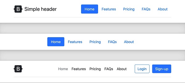
Navigation bar case 
7.22.14. Example 