We can use it.
.input-group
class to add more styles, such as icons, text, or buttons, to the form input box.
.input-group-text
class to style the text.
Use Text information can be replaced with check boxes and radio boxes: There is no need to add a drop-down menu to the input box In the input box group, through the 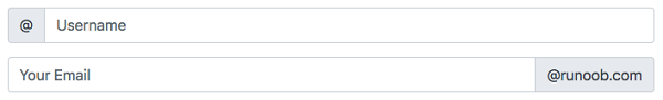
7.35.1. Bootstrap instance 
<form>
  <div class="input-group mb-3">
    <span class="input-group-text">@</span>
    <input type="text" class="form-control" placeholder="Username">
  </div>

  <div class="input-group">
    <input type="text" class="form-control" placeholder="Your Email">
    <span class="input-group-text">@runoob.com</span>
  </div>
</form>
Input box size 
.input-group-sm
class to set a small input box
.input-group-lg
,class sets a large input box: 7.35.2. Bootstrap instance 
<div class="input-group mb-3 input-group-sm">
   <span class="input-group-text">Small</span>
  <input type="text" class="form-control">
</div>

<div class="input-group mb-3">
  <span class="input-group-text">Default</span>
  <input type="text" class="form-control">>
</div>

<div class="input-group mb-3 input-group-lg">
  <span class="input-group-text">Large</span>
  <input type="text" class="form-control">
</div>
Multiple input boxes and text 
7.35.3. Bootstrap instance 
<!-- Multiple input boxes -->
<div class="input-group mb-3">
  <span class="input-group-text">Person</span>
  <input type="text" class="form-control" placeholder="First Name">
  <input type="text" class="form-control" placeholder="Last Name">
</div>

<!-- Multiple text messages -->
<div class="input-group mb-3">
  <span class="input-group-text">One</span>
  <span class="input-group-text">Two</span>
  <span class="input-group-text">Three</span>
  <input type="text" class="form-control">
</div>
Check boxes and checkboxes 
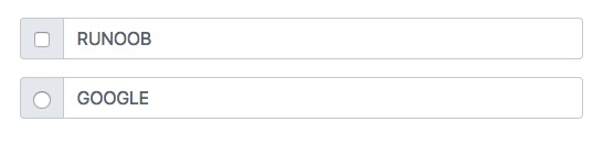
7.35.4. Bootstrap instance 
<div class="input-group mb-3">
  <div class="input-group-text">
    <input type="checkbox">
  </div>
  <input type="text" class="form-control" placeholder="RUNOOB">
</div>

<div class="input-group mb-3">
  <div class="input-group-text">
    <input type="radio">
  </div>
  <input type="text" class="form-control" placeholder="GOOGLE">
</div>
Input box to add button group 
7.35.5. Bootstrap instance 
<div class="input-group mb-3">
  <button class="btn btn-outline-primary" type="button">Basic Button</button>
  <input type="text" class="form-control" placeholder="Some text">
</div>

<div class="input-group mb-3">
  <input type="text" class="form-control" placeholder="Search">
  <button class="btn btn-success" type="submit">Go</button>
</div>

<div class="input-group mb-3">
  <input type="text" class="form-control" placeholder="Something clever..">
  <button class="btn btn-primary" type="button">OK</button>
  <button class="btn btn-danger" type="button">Cancel</button>
</div>
Set the drop-down menu 
.dropdown
class.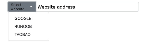
7.35.6. Bootstrap instance 
<div class="input-group mt-3 mb-3">
  <button type="button" class="btn btn-primary dropdown-toggle" data-bs-toggle="dropdown">
    Select website
  </button>
  <ul class="dropdown-menu">
    <li><a class="dropdown-item" href="https://www.google.com">GOOGLE</a></li>
    <li><a class="dropdown-item" href="https://www.runoob.com">RUNOOB</a></li>
    <li><a class="dropdown-item" href="https://www.taobao.com">TAOBAO</a></li>
  </ul>
  <input type="text" class="form-control" placeholder="Website address">
</div>
Input box group label 
label
to set the label, the label
for
the attribute needs to correspond to the id of the input box group. Click the label to focus on the input box: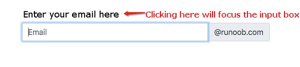
7.35.7. Bootstrap instance 
<form>
    <label for="demo">Enter your email here:</label>
    <div class="input-group mb-3">
        <input type="text" class="form-control" placeholder="Email" id="demo" name="email">
         <span class="input-group-text">@runoob.com</span>
    </div>
</form>