7.18.1. A simple card 
We can use Bootstrap5’s
.card
and
.card-body
class to create a simple card that can contain header, content, bottom, and various color settings, as shown in the following example:
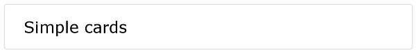
Example 
<div class="card">
  <div class="card-body">Simple cards</div>
</div>
7.18.2. Head and bottom 
.card-header
class is used to create the header style of the card
.card-footer
class is used to create the bottom style of the card:
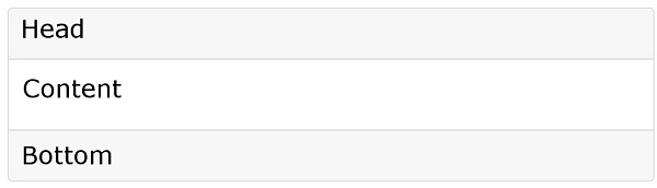
Example 
<div class="card">
  <div class="card-header">header</div>
  <div class="card-body">body</div>
  <div class="card-footer">footer</div>
</div>
7.18.3. Multi-color card 
Bootstrap 4 provides a variety of card background color categories:
.bg-primary
,
.bg-success
,
.bg-info
,
.bg-warning
,
.bg-danger
,
.bg-secondary
,
.bg-dark
and
.bg-light
.

Example 
<div class="container">
  <h2>Multiple color cards</h2>
  <div class="card">
    <div class="card-body">Basic Card</div>
  </div>
  <br>
  <div class="card bg-primary text-white">
    <div class="card-body">Main cards</div>
  </div>
  <br>
  <div class="card bg-success text-white">
    <div class="card-body">Success Card</div>
  </div>
  <br>
  <div class="card bg-info text-white">
    <div class="card-body">Information card</div>
  </div>
  <br>
  <div class="card bg-warning text-white">
    <div class="card-body">Warning card</div>
  </div>
  <br>
  <div class="card bg-danger text-white">
    <div class="card-body">Danger Card</div>
  </div>
  <br>
  <div class="card bg-secondary text-white">
    <div class="card-body">Secondary Card</div>
  </div>
  <br>
  <div class="card bg-dark text-white">
    <div class="card-body">Black Card</div>
  </div>
  <br>
  <div class="card bg-light text-dark">
    <div class="card-body">Light colored cards</div>
  </div>
</div>
7.18.4. Title, text, and link 
We can use it on the header element
.card-title
class to set the title of the card.
.card-body
class is used to set the contents of the card body.
.card-text
class is used to set the card
.card-body
in the class
<p>
label, if the last line can remove the bottom margin.
.card-link
class is used to set the color for links.Example 
<div class="card">
  <div class="card-body">
    <h4 class="card-title">Card title</h4>
    <p class="card-text">Some example text. Some example text.</p>
    <a href="#" class="card-link">Card link</a>
    <a href="#" class="card-link">Another link</a>
  </div>
</div>
7.18.5. Picture card 
We can give If you want to set the picture as the background, you can use the
<img>
add
.card-img-top
(the picture is above the text) or
.card-img-bottom
(the picture is below the text to set the picture card:Example 
<div class="card" style="width:400px">
  <img class="card-img-top" src="img_avatar1.png" alt="Card image">
  <div class="card-body">
    <h4 class="card-title">John Doe</h4>
    <p class="card-text">Some example text.</p>
    <a href="#" class="btn btn-primary">See Profile</a>
  </div>
</div>
.card-img-overlay
class:Example 
<div class="card" style="width:500px">
  <img class="card-img-top" src="img_avatar1.png" alt="Card image">
  <div class="card-img-overlay">
    <h4 class="card-title">John Doe</h4>
    <p class="card-text">Some example text.</p>
    <a href="#" class="btn btn-primary">See Profile</a>
  </div>
</div>