When a user clicks a link, presses a button, or enters text, the interaction of these users will be triggered.
DOM
events.
In this chapter, we will learn how to bind these events using Angular event binding syntax.
The following Gif figure illustrates the operation of this example:
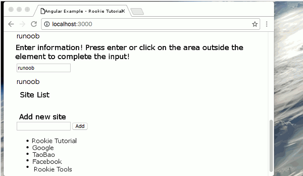
The source code can be downloaded at the end of the article. We can use the Angular event binding mechanism to respond to any DOM event. The following example binds the click event: The click to the left of the equal sign indicates that the click event of the button is taken as the binding target. To the right of the equal sign, the text in the quotation marks is a template statement The complete code is as follows: We can bind to all types of events. Let’s try binding to an input box In the above code, we listen for an event and capture user input, and Angular stores the event object in the Component You can display user data by using local template variables, and template reference variables are achieved by adding a pound sign (#) before the identifier. The following example shows how to use local template variables: We’re here We can use template reference variables to modify the above We can get the value of the input box only when the user presses the enter (enter) key. (keyup) the event handling statement hears every keystroke, and we can filter the keystroke, such as every keystroke Angular can filter keyboard events for us by binding to Angular’s Next we can use the The following example listens for events that both the enter key and the input box lose focus. The source code used in this article can be downloaded in the following ways, not including 1.6.1. Bind to user input event 
<button (click)="onClickMe()">Click me!</button>
app/click-me.component.ts
file: ¶ import { Component } from '@angular/core';
@Component({
selector: 'click-me',
template: `
<button (click)="onClickMe()">Click me!</button>
{{clickMessage}}`
})
export class ClickMeComponent {
clickMessage = '';
onClickMe() {
this.clickMessage = 'Rookie Tutorial!';
}
}
1.6.2. Pass through
$event
object to get user input 
keyup
event and echo what the user typed back to the screen.
app/keyup.component.ts
(V1) file: ¶ @Component({
selector: 'key-up1',
template: `
<input (keyup)="onKey($event)">
<p>{{values}}</p>
`
})
export class KeyUpComponent_v1 {
values = '';
/*
// Non strongly typed
onKey(event:any) {
this.values += event.target.value + ' | ';
}
*/
// strongly typed
onKey(event: KeyboardEvent) {
this.values += (<HTMLInputElement>event.target).value + ' | ';
}
}
$event
variable.
onKey()
method is used to extract user input from the event object and add the input value to the
values
property. 1.6.3. Get user input from a template reference variable 
app/loop-back.component.ts
file: ¶ @Component({
selector: 'loop-back',
template: `
<input #box (keyup)="0">
<p>{{box.value}}</p>
`
})
export class LoopbackComponent { }
<input>
Element defines a file named
box
the template reference variable of the
box
variable refers to the
<input>
element itself, which means that we can get the input element’s
value
value and display it in the
<p>
tag.
keyup
example:
app/keyup.components.ts
(V2) documents: ¶ @Component({
selector: 'key-up2',
template: `
<input #box (keyup)="onKey(box.value)">
<p>{{values}}</p>
`
})
export class KeyUpComponent_v2 {
values = '';
onKey(value: string) {
this.values += value + ' | ';
}
}
1.6.4. Keystroke event filtering (via
key.enter
) 
$event.keyCode
updated only when the enter key is pressed
values
property.
keyup.enter
the pseudo event listens for the event of the enter key.
app/keyup.components.ts
(v3): ¶ @Component({
selector: 'key-up3',
template: `
<input #box (keyup.enter)="values=box.value">
<p>{{values}}</p>
`
})
export class KeyUpComponent_v3 {
values = '';
}
1.6.5.
blur
(loss of focus) event 
blur
(lose focus) event, which can be updated afterthe element loses focus
values
property.
app/keyup.components.ts
(v4): ¶ @Component({
selector: 'key-up4',
template: `
<input #box
(keyup.enter)="values=box.value"
(blur)="values=box.value">
<p>{{values}}</p>
`
})
export class KeyUpComponent_v4 {
values = '';
}
node_modules
and
typings
catalogue.