Component (Component) is
Vue.js
one of the most powerful functions.
Components can extend HTML elements to encapsulate reusable code.
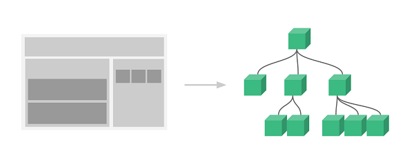
The component system allows us to build large applications with independently reusable widgets, and the interface of almost any type of application can be abstracted into a component tree:
Every one of them.
Vue
applications are all done by using the
createApp
function, passed to the
createApp
is used to configure the root component When we mount the application, this component is used as the starting point for rendering.
An application needs to be mounted into a DOM element.
For the following example, we will
Vue
the application is mounted to < div id= “app” > < / div > and should be passed in
#app
:
const RootComponent = { /* option */ }
const app = Vue.createApp(RootComponent)
const vm = app.mount('#app')
The syntax for registering a global component is as follows:
const app = Vue.createApp({...})

app.component('my-component-name', {
  /* ... */
})
my-component-name
is the component name
     /\*
     ...
     \*/
the part is the configuration options. After registration, we can invoke the component in the following ways:
<my-component-name></my-component-name>
A simple Register a simple global component Next, let’s register another one. Note: You can reuse the component any number of times: In the above examples, our components only pass through the Globally registered components can be created later in the Register a simple global component Global registration is often not ideal. For example, if you use something like In these cases, you can define components through a normal JavaScript object: And then in For We can also register the local component in the instance option so that the component can only be used in this instance: Register a simple local component The data of the parent component needs to be passed through the By default, a component can have any number of Similar to using the Component can be a In order to customize When
Vue
an example of a component: 2.10.1. Global component instance 
runoob
and use it:<divid="app"><runoob></runoob></div><script>// Create a Vue application const
app = Vue.createApp({}) // Define a new global component called runoob
app.component('runoob', { template: '<h1>Custom Components!</h1>' })
app.mount('#app')</script>
button-counter
component, after each click, the counter will be added by 1:Example 
// Create a Vue application
const app = Vue.createApp({})
// Define a new global component called button counter
app.component('button-counter', {
  data() {
    return {
      count: 0
    }
  },
  template: \`
    <button @click="count++">
      Clicked {{count}} times!
    </button>\`
})
app.mount('#app')
</script>
template
is a back quotation mark, not just a quote’. 2.10.2. Reuse of components 
Example 
<div id="components-demo">
  <button-counter></button-counter>
  <button-counter></button-counter>
  <button-counter></button-counter>
</div>
2.10.3. Global component 
component
globally registered.
app
used in the instance template, and also in the templates of all subcomponents in theroot instance component tree. 2.10.4. Global component instance 
runoob
and use it:<divid="app"><runoob></runoob></div><script>// Create a Vue application const
app = Vue.createApp({}) // Define a new global component called runoob
app.component('runoob', { template: '<h1>Custom Components!</h1>' })
app.mount('#app')</script>
2.10.5. Local component 
webpack
in such a build system, registering all components globally means that even if you no longer use a component, it will still be included in your final build result. This has resulted in an unnecessary increase in the number of JavaScript downloaded by users.const ComponentA = {
/* ... */
}
const ComponentB = {
/* ... */
}
const ComponentC = {
/* ... */
}
components
option to define the components you want to use:const app = Vue.createApp({
components: {
'component-a': ComponentA,
'component-b': ComponentB
}
})
components
each attribute in the object, the attribute name is the name of the custom element (component-a, component-b), and the attributevalue is the component’s option object (ComponentA, ComponentB). 2.10.6. Local component instance 
runoobA
and use it:<divid="app"><runoob-a></runoob-a></div><script>var runoobA = {
template: '<h1>Custom Components!</h1>' } const app = Vue.createApp({
components: { 'runoob-a': runoobA } }) app.mount('#app')</script>
2.10.7.
Prop
prop
is a custom property that the child component uses to accept the data passed by the parent component.
props
pass data to the subcomponent, which needs to explicitly use the
props
option declaration “prop”:Prop instance 
<divid="app"><site-nametitle="Google"></site-name><site-nametitle="Runoob"></site-name><site-nametitle="Taobao"></site-name></div><script>const
app = Vue.createApp({}) app.component('site-name', { props: ['title'],
template: \`<h4>{{ title }}</h4>\` }) app.mount('#app')</script>
prop
any value can be passed to any
prop
. 2.10.8. Dynamic Prop 
v-bind
bind the HTML attribute to an expression, or you can use the
v-bind
dynamic binding
props
into the data of the parent component Whenever the data of the parent component changes, the change is also transmitted to the child component:Prop instance 
<divid="app"><site-infov-for="site in
sites":id="site.id":title="site.title"></site-info></div><script>const
Site = { data() { return { sites: [ { id: 1, title: 'Google' }, { id: 2,
title: 'Runoob' }, { id: 3, title: 'Taobao' } ] } } } const app =
Vue.createApp(Site) app.component('site-info', { props: ['id','title'],
template: \`<h4>{{ id }} - {{ title }}</h4>\` })
app.mount('#app')</script>
2.10.9. Prop verification 
props
specify validation requirements.
prop
can use the verification method for
props
provides an object with validation requirements rather than an array of strings. For example:Vue.component('my-component', {
props: {
// Basic type check (`null` and `undefined` will pass any type of verification)
propA: Number,
// Multiple possible types
propB: [String, Number],
// Required string
propC: {
type: String,
required: true
},
// Numbers with default values
propD: {
type: Number,
default: 100
},
// Objects with default values
propE: {
type: Object,
// The default value of an object or array must be obtained from a factory function
default: function () {
return { message: 'hello' }
}
},
// Custom validation function
propF: {
validator: function (value) {
// This value must match one of the following strings
return ['success', 'warning', 'danger'].indexOf(value) !== -1
}
}
}
})
prop
validation fails, Vue (the build of the development environment) will generate a console warning.
type
can be the following native constructor:
String
Number
Boolean
Array
Object
Date
Function
Symbol
type
can also be a custom constructor, using the
instanceof
test.