Using Python to realize geographic information mapping (including scale, north compass and legend)
Preface
Recently, when using GIS to plot in batches, I found it really troublesome to plot one by one. So here is today's article, which will initially teach you how to use Python to produce GIS maps that are a little more professional.
Library function preparation
The library functions used this time are not many, mainly the following:
from osgeo import gdal
import numpy as np
import matplotlib.pyplot as plt
import matplotlib.colors as cor
import cartopy.io.shapereader as sr
import cartopy.feature as cfeature
from cartopy.mpl.gridliner import LONGITUDE_FORMATTER, LATITUDE_FORMATTER
import matplotlib.pyplot as plt
import matplotlib.patches as mpatches
import cartopy.crs as ccrs
from matplotlib.path import Path
from matplotlib.patches import PathPatch
import shapefile
Segment explanation
Statement: Adding a scale bar, adding a compass, etc. are not my original works, but also collected from CSDN, Github, etc
But I have more or less modified the original code to make it more useful.
Add a scale bar
The original code contains three styles of legends, all of which look good.
Ax: is the sub-graph we created
Lon, lat: It is the coordinate where we want to put the legend, according to personal preference!!!
Length: is the proportion of our proportion, such as 200.
Size: It controls the height of the scale (the height of the three vertical lines on the scale will be shown later)
#-----------Functions: adding scale bars--------------
def add_scalebar(ax,lon0,lat0,length,size=0.45):
    '''
    ax: coordinate axis
    lon0: longitude
    lat0: latitude
    length: length
    size: control the thickness and distance
    '''
    # style 3
    ax.hlines(y=lat0,  xmin = lon0, xmax = lon0+length/111, colors="black", ls="-", lw=1, label='%d km' % (length))
    ax.vlines(x = lon0, ymin = lat0-size, ymax = lat0+size, colors="black", ls="-", lw=1)
    ax.vlines(x = lon0+length/2/111, ymin = lat0-size, ymax = lat0+size, colors="black", ls="-", lw=1)
    ax.vlines(x = lon0+length/111, ymin = lat0-size, ymax = lat0+size, colors="black", ls="-", lw=1)
    ax.text(lon0+length/111,lat0+size+0.05,'%d' % (length),horizontalalignment = 'center')
    ax.text(lon0+length/2/111,lat0+size+0.05,'%d' % (length/2),horizontalalignment = 'center')
    ax.text(lon0,lat0+size+0.05,'0',horizontalalignment = 'center')
    ax.text(lon0+length/111/2*3,lat0+size+0.05,'km',horizontalalignment = 'center')

    # style 1
    # print(help(ax.vlines))
    # ax.hlines(y=lat0,  xmin = lon0, xmax = lon0+length/111, colors="black", ls="-", lw=2, label='%d km' % (length))
    # ax.vlines(x = lon0, ymin = lat0-size, ymax = lat0+size, colors="black", ls="-", lw=2)
    # ax.vlines(x = lon0+length/111, ymin = lat0-size, ymax = lat0+size, colors="black", ls="-", lw=2)
    # # ax.text(lon0+length/2/111,lat0+size,'500 km',horizontalalignment = 'center')
    # ax.text(lon0+length/2/111,lat0+size,'%d' % (length/2),horizontalalignment = 'center')
    # ax.text(lon0,lat0+size,'0',horizontalalignment = 'center')
    # ax.text(lon0+length/111/2*3,lat0+size,'km',horizontalalignment = 'center')

    # style 2
    # plt.hlines(y=lat0,  xmin = lon0, xmax = lon0+length/111, colors="black", ls="-", lw=1, label='%d km' % (length))
    # plt.vlines(x = lon0, ymin = lat0-size, ymax = lat0+size, colors="black", ls="-", lw=1)
    # plt.vlines(x = lon0+length/111, ymin = lat0-size, ymax = lat0+size, colors="black", ls="-", lw=1)
    # plt.text(lon0+length/111,lat0+size,'%d km' % (length),horizontalalignment = 'center')
    # plt.text(lon0,lat0+size,'0',horizontalalignment = 'center')
Add a scale bar
Who shared the original code of the code that added the north arrow!!!!
def add_north(ax, labelsize=18, loc_x=0.88, loc_y=0.85, width=0.06, height=0.09, pad=0.14):
    """
    Draw a scale bar with 'N' text note
    The main parameters are as follows
    :param ax: Obtain the Axes instance plt. gca() of the coordinate area to be drawn
    :param labelsize: Display the size of 'N' text
    :param loc_x: The horizontal proportion of the whole ax centered on the lower part of the text
    :param loc_y: The vertical proportion of the whole ax centered on the lower part of the text
    :param width: Compass to ax ratio width
    :param height: Proportion height of compass to ax
    :param pad: Gap between text symbols and ax
    :return: None
    """
    minx, maxx = ax.get_xlim()
    miny, maxy = ax.get_ylim()
    ylen = maxy - miny
    xlen = maxx - minx
    left = [minx + xlen*(loc_x - width*.5), miny + ylen*(loc_y - pad)]
    right = [minx + xlen*(loc_x + width*.5), miny + ylen*(loc_y - pad)]
    top = [minx + xlen*loc_x, miny + ylen*(loc_y - pad + height)]
    center = [minx + xlen*loc_x, left[1] + (top[1] - left[1])*.4]
    triangle = mpatches.Polygon([left, top, right, center], color='k')
    ax.text(s='N',
            x=minx + xlen*loc_x,
            y=miny + ylen*(loc_y - pad + height),
            fontsize=labelsize,
            horizontalalignment='center',
            verticalalignment='bottom')
    ax.add_patch(triangle)
Image clipping code
def shp2clip(originfig, ax, shpfile):
    '''
    originfig: colorbar
    ax: Axis
    shpfile: Shp file
    '''
    sf = shapefile.Reader(shpfile)
    vertices = []
    codes = []
    for shape_rec in sf.shapeRecords():
        pts = shape_rec.shape.points
        prt = list(shape_rec.shape.parts) + [len(pts)]
        for i in range(len(prt) - 1):
            for j in range(prt[i], prt[i + 1]):
                vertices.append((pts[j][0], pts[j][1]))
            codes += [Path.MOVETO]
            codes += [Path.LINETO] * (prt[i + 1] - prt[i] - 2)
            codes += [Path.CLOSEPOLY]
        clip = Path(vertices, codes)
        clip = PathPatch(clip, transform=ax.transData)
    for contour in originfig.collections:
        contour.set_clip_path(clip)
    return contour
Grid data reading
The data is still used to make the temperature data of Jiangsu Province generated in our previous article. At the end of the article, I will link to a Baidu online disk. I will share the data with you so that you can do the test!
The library is mainly GDAL. If you have anaconda, you can install it directly by using anaconda. If you don't have it, you can download it from this website.
values = gdal.Open('D:\CSDN\Kriging interpolation/test data.tif')
x_ = values.RasterXSize  # Width, read how many grid points are in the x coordinate
y_ = values.RasterYSize  # High, read how many grid points are in the y coordinate
adfGeoTransform = values.GetGeoTransform() # Get Affine Matrix
values = values.ReadAsArray() # Read data
# values_mask=np.ma.masked_where(values==0,values) #Mask the 0 value
x = []
# The next two loops generally mean generating X and Y coordinates (one-dimensional!!)
for i in range(x_):
    x.append(adfGeoTransform[0] + i * adfGeoTransform[1]) #Abscissa
y = []
for i in range(y_):
    y.append(adfGeoTransform[3] + i * adfGeoTransform[5]) #Ordinate
# print(adfGeoTransform)
Drawing function
crs = ccrs.PlateCarree() # Set Projection
fig = plt.figure(figsize = (10, 15), dpi = 300) #Create a drawing object
ax1 = plt.subplot(1, 1, 1, projection = crs) #Create a subgraph
geom = sr.Reader(r"D:\CSDN\Kriging interpolation Jiangsu shp/Jiangsu.shp").geometries() #Read shp file
ax1.add_geometries(geom, crs,facecolor='none', edgecolor='black',linewidth=0.5) #Draw Graph
ax1.add_feature(cfeature.OCEAN.with_scale('50m')) # Add ocean
ax1.add_feature(cfeature.LAND.with_scale('50m')) # Add land
ax1.add_feature(cfeature.RIVERS.with_scale('50m')) # Add River
ax1.add_feature(cfeature.LAKES.with_scale('50m')) # Add a lake
ax1.set_extent([116, 123, 30, 36]) # Set display range
c = ax1.contourf(x, y, values, cmap='coolwarm',levels=np.arange(23, 28, 0.5),projection=crs) # Draw isoline
gl = ax1.gridlines(draw_labels=True, linewidth=0.5, color='k', alpha=0.5, linestyle='--') # Set gridlines
# If you don't like gridlines, you can replace the above linewidth=0.5 with linewidth=0
gl.xlabels_top = False
gl.ylabels_right = False
add_north(ax1)
add_scalebar(ax1,116.2,30.5,200,size=0.2) # Add a scale bar
shp2clip(c, ax1, r'D:\CSDN\Kriging interpolation Jiangsu shp/Jiangsu.shp') # Add interpolation region
plt.colorbar(c) # Add color ruler
plt.show() # Display image
Full code display
from osgeo import gdal
import numpy as np
import matplotlib.pyplot as plt
import matplotlib.colors as cor
import cartopy.io.shapereader as sr
import cartopy.feature as cfeature
from cartopy.mpl.gridliner import LONGITUDE_FORMATTER, LATITUDE_FORMATTER
import matplotlib.pyplot as plt
import matplotlib.patches as mpatches
import cartopy.crs as ccrs
from matplotlib.path import Path
from matplotlib.patches import PathPatch
import shapefile

def add_north(ax, labelsize=18, loc_x=0.88, loc_y=0.85, width=0.06, height=0.09, pad=0.14):
    """
    Draw a scale bar with 'N' text note
    The main parameters are as follows
    :param ax: Obtain the Axes instance plt. gca() of the coordinate area to be drawn
    :param labelsize: Display the size of 'N' text
    :param loc_x: The horizontal proportion of the whole ax centered on the lower part of the text
    :param loc_y: The vertical proportion of the whole ax centered on the lower part of the text
    :param width: Compass to ax ratio width
    :param height: Proportion height of compass to ax
    :param pad: Gap between text symbols and ax
    :return: None
    """
    minx, maxx = ax.get_xlim()
    miny, maxy = ax.get_ylim()
    ylen = maxy - miny
    xlen = maxx - minx
    left = [minx + xlen*(loc_x - width*.5), miny + ylen*(loc_y - pad)]
    right = [minx + xlen*(loc_x + width*.5), miny + ylen*(loc_y - pad)]
    top = [minx + xlen*loc_x, miny + ylen*(loc_y - pad + height)]
    center = [minx + xlen*loc_x, left[1] + (top[1] - left[1])*.4]
    triangle = mpatches.Polygon([left, top, right, center], color='k')
    ax.text(s='N',
            x=minx + xlen*loc_x,
            y=miny + ylen*(loc_y - pad + height),
            fontsize=labelsize,
            horizontalalignment='center',
            verticalalignment='bottom')
    ax.add_patch(triangle)

#-----------Functions: adding scale bars--------------
def add_scalebar(ax,lon0,lat0,length,size=0.45):
    '''
    ax: Axis
    lon0: longitude
    lat0: latitude
    length: length
    size: Control thickness and distance
    '''
    # style 3
    ax.hlines(y=lat0,  xmin = lon0, xmax = lon0+length/111, colors="black", ls="-", lw=1, label='%d km' % (length))
    ax.vlines(x = lon0, ymin = lat0-size, ymax = lat0+size, colors="black", ls="-", lw=1)
    ax.vlines(x = lon0+length/2/111, ymin = lat0-size, ymax = lat0+size, colors="black", ls="-", lw=1)
    ax.vlines(x = lon0+length/111, ymin = lat0-size, ymax = lat0+size, colors="black", ls="-", lw=1)
    ax.text(lon0+length/111,lat0+size+0.05,'%d' % (length),horizontalalignment = 'center')
    ax.text(lon0+length/2/111,lat0+size+0.05,'%d' % (length/2),horizontalalignment = 'center')
    ax.text(lon0,lat0+size+0.05,'0',horizontalalignment = 'center')
    ax.text(lon0+length/111/2*3,lat0+size+0.05,'km',horizontalalignment = 'center')

    # style 1
    # print(help(ax.vlines))
    # ax.hlines(y=lat0,  xmin = lon0, xmax = lon0+length/111, colors="black", ls="-", lw=2, label='%d km' % (length))
    # ax.vlines(x = lon0, ymin = lat0-size, ymax = lat0+size, colors="black", ls="-", lw=2)
    # ax.vlines(x = lon0+length/111, ymin = lat0-size, ymax = lat0+size, colors="black", ls="-", lw=2)
    # # ax.text(lon0+length/2/111,lat0+size,'500 km',horizontalalignment = 'center')
    # ax.text(lon0+length/2/111,lat0+size,'%d' % (length/2),horizontalalignment = 'center')
    # ax.text(lon0,lat0+size,'0',horizontalalignment = 'center')
    # ax.text(lon0+length/111/2*3,lat0+size,'km',horizontalalignment = 'center')

    # style 2
    # plt.hlines(y=lat0,  xmin = lon0, xmax = lon0+length/111, colors="black", ls="-", lw=1, label='%d km' % (length))
    # plt.vlines(x = lon0, ymin = lat0-size, ymax = lat0+size, colors="black", ls="-", lw=1)
    # plt.vlines(x = lon0+length/111, ymin = lat0-size, ymax = lat0+size, colors="black", ls="-", lw=1)
    # plt.text(lon0+length/111,lat0+size,'%d km' % (length),horizontalalignment = 'center')
    # plt.text(lon0,lat0+size,'0',horizontalalignment = 'center')

def shp2clip(originfig, ax, shpfile):
    '''
    originfig: colorbar
    ax: Axis
    shpfile: Shp file
    '''
    sf = shapefile.Reader(shpfile)
    vertices = []
    codes = []
    for shape_rec in sf.shapeRecords():
        pts = shape_rec.shape.points
        prt = list(shape_rec.shape.parts) + [len(pts)]
        for i in range(len(prt) - 1):
            for j in range(prt[i], prt[i + 1]):
                vertices.append((pts[j][0], pts[j][1]))
            codes += [Path.MOVETO]
            codes += [Path.LINETO] * (prt[i + 1] - prt[i] - 2)
            codes += [Path.CLOSEPOLY]
        clip = Path(vertices, codes)
        clip = PathPatch(clip, transform=ax.transData)
    for contour in originfig.collections:
        contour.set_clip_path(clip)
    return contour

values = gdal.Open('D:\CSDN\Kriging interpolation/test data.tif')
x_ = values.RasterXSize  # wide
y_ = values.RasterYSize  # high
adfGeoTransform = values.GetGeoTransform() # Get Affine Matrix

values = values.ReadAsArray() # Read data
# values_mask=np.ma.masked_where(values==0,values) #Mask the 0 value
x = []
for i in range(x_):
    x.append(adfGeoTransform[0] + i * adfGeoTransform[1]) #Abscissa
y = []
for i in range(y_):
    y.append(adfGeoTransform[3] + i * adfGeoTransform[5]) #Ordinate
print(adfGeoTransform)

crs = ccrs.PlateCarree()
fig = plt.figure(figsize = (10, 15), dpi = 300) #Create a drawing object
ax1 = plt.subplot(1, 1, 1, projection = crs) #Create a subgraph
geom = sr.Reader(r"D:\CSDN\Kriging interpolation Jiangsu shp/Jiangsu.shp").geometries() #Read shp file
ax1.add_geometries(geom, crs,facecolor='none', edgecolor='black',linewidth=0.5) #Draw Graph
ax1.add_feature(cfeature.OCEAN.with_scale('50m')) # Add ocean
ax1.add_feature(cfeature.LAND.with_scale('50m')) # Add land
ax1.add_feature(cfeature.RIVERS.with_scale('50m')) # Add River
ax1.add_feature(cfeature.LAKES.with_scale('50m')) # Add a lake
ax1.set_extent([116, 123, 30, 36]) # Set display range
c = ax1.contourf(x, y, values, cmap='coolwarm',levels=np.arange(23, 28, 0.5),projection=crs) # Draw isoline
gl = ax1.gridlines(draw_labels=True, linewidth=0.5, color='k', alpha=0.5, linestyle='--') # Set gridlines
# If you don't like gridlines, you can replace the above linewidth=0.5 with linewidth=0
gl.xlabels_top = False
gl.ylabels_right = False
add_north(ax1)
add_scalebar(ax1,116.2,30.5,200,size=0.2) # Add a scale bar
shp2clip(c, ax1, r'D:\CSDN\Kriging interpolation Jiangsu shp/Jiangsu.shp') # Add interpolation region
plt.colorbar(c) # Add color ruler
plt.show() # Display image
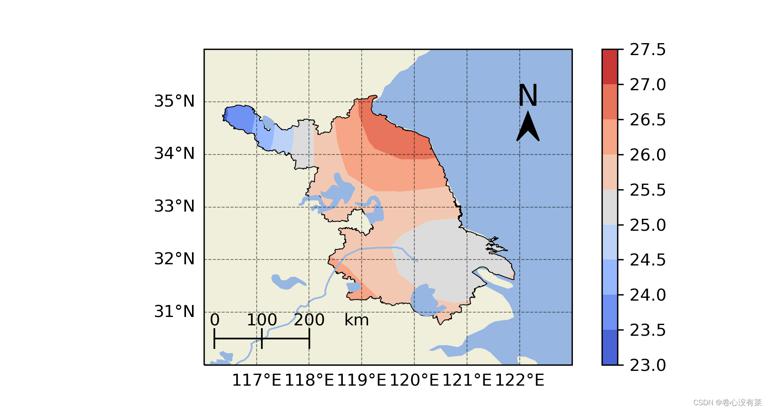
The overall picture is as follows. If you don't like the marks on the map, you can comment out the codes of lakes and rivers added on it!