Bootstrap 5 provides a lot of useful classes to help us achieve results quickly without having to rewrite some CSS code. When setting the background color of different elements, you need to pass the We can use it. The following sets the different colors of the border: Rounded related classes are used to set fillets: Element floats to the right to use the You can also set the floating effect according to the screen size ( Use Width usage High use 7.29.1. Background color 
.text-\*
class to set the matching text color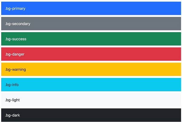
Example 
<div class="p-3 mb-2 bg-primary text-white">.bg-primary</div>
<div class="p-3 mb-2 bg-secondary text-white">.bg-secondary</div>
<div class="p-3 mb-2 bg-success text-white">.bg-success</div>
<div class="p-3 mb-2 bg-danger text-white">.bg-danger</div>
<div class="p-3 mb-2 bg-warning text-dark">.bg-warning</div>
<div class="p-3 mb-2 bg-info text-dark">.bg-info</div>
<div class="p-3 mb-2 bg-light text-dark">.bg-light</div>
<div class="p-3 mb-2 bg-dark text-white">.bg-dark</div>
<div class="p-3 mb-2 bg-body text-dark">.bg-body</div>
<div class="p-3 mb-2 bg-white text-dark">.bg-white</div>
<div class="p-3 mb-2 bg-transparent text-dark">.bg-transparent</div>
.bg-gradient
class can set the effect of the background color gradientExample 
<div class="p-3 mb-2 bg-primary bg-gradient text-white">.bg-primary</div>
<div class="p-3 mb-2 bg-secondary bg-gradient text-white">.bg-secondary</div>
<div class="p-3 mb-2 bg-success bg-gradient text-white">.bg-success</div>
<div class="p-3 mb-2 bg-danger bg-gradient text-white">.bg-danger</div>
<div class="p-3 mb-2 bg-warning bg-gradient text-dark">.bg-warning</div>
<div class="p-3 mb-2 bg-info bg-gradient text-dark">.bg-info</div>
<div class="p-3 mb-2 bg-light bg-gradient text-dark">.bg-light</div>
<div class="p-3 mb-2 bg-dark bg-gradient text-white">.bg-dark</div>
<div class="p-3 mb-2 bg-body bg-gradient text-dark">.bg-body</div>
<div class="p-3 mb-2 bg-white bg-gradient text-dark">.bg-white</div>
<div class="p-3 mb-2 bg-transparent bg-gradient text-dark">.bg-transparent</div>
7.29.2. Frame 
border
related classes display borders as needed:
Example 
<span class="border"></span>
<span class="border border-0"></span>
<span class="border border-top-0"></span>
<span class="border border-right-0"></span>
<span class="border border-bottom-0"></span>
<span class="border border-left-0"></span>
<br>

<span class="border-top"></span>
<span class="border-end"></span>
<span class="border-bottom"></span>
<span class="border-start"></span>
.border-1
to
.border-5
class is used to set the width of the borderline:Example 
<span class="border border-1"></span>
<span class="border border-2"></span>
<span class="border border-3"></span>
<span class="border border-4"></span>
<span class="border border-5"></span>
Example 
<span class="border border-primary"></span>
<span class="border border-secondary"></span>
<span class="border border-success"></span>
<span class="border border-danger"></span>
<span class="border border-warning"></span>
<span class="border border-info"></span>
<span class="border border-light"></span>
<span class="border border-dark"></span>
<span class="border border-white"></span>
Example 
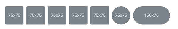
<img src="..." class="rounded" alt="...">
<img src="..." class="rounded-top" alt="...">
<img src="..." class="rounded-end" alt="...">
<img src="..." class="rounded-bottom" alt="...">
<img src="..." class="rounded-start" alt="...">
<img src="..." class="rounded-circle" alt="...">
<img src="..." class="rounded-pill" alt="...">
rounded-0
to
rounded-3
class is used to set the size of the filletExample 
<img src="..." class="rounded-0" alt="...">
<img src="..." class="rounded-1" alt="...">
<img src="..." class="rounded-2" alt="...">
<img src="..." class="rounded-3" alt="...">
7.29.3. Float and clear float 
.float-end
class, floating to the left using the
.float-start
class
.clearfix
class is used to clear floats:Example 
<div class="clearfix">
  <span class="float-start">Float left</span>
  <span class="float-end">Float right</span>
</div>
.float-*-left|right
-* indicates sm (> = 576px), md (> = 768px), lg (> = 992px), xl (> = 1200px) or xxl (> = 1400px):Example 
<div class="float-sm-end">Small screen floating to the right</div><br>
<div class="float-md-end">Medium screen floating to the right</div><br>
<div class="float-lg-end">Large screen floating to the right</div><br>
<div class="float-xl-end">Large screen floating to the right</div><br>
<div class="float-xxl-end">Extra large screen floating to the right</div><br>
<div class="float-none">No float</div>
7.29.4. Center alignment 
.mx-auto
class to set the center alignment of elements (add
margin-left
and
margin-right
for auto):Example 
<div class="mx-auto bg-warning" style="width:150px">center aligned</div>
7.29.5. Width and height 
      w-\*
      (.w-25,
      .w-50,
      .w-75,
      .w-100,
      .mw-auto,
      .mw-100)
class to set the.Example 
<div class="w-25 bg-warning">25% width</div>
<div class="w-50 bg-warning">50% width</div>
<div class="w-75 bg-warning">75% width</div>
<div class="w-100 bg-warning">100% width</div>
<div class="w-auto bg-warning">Automatically set width</div>
<div class="mw-100 bg-warning">100% width</div>
       h-\*
       (.h-25,
       .h-50,
       .h-75,
       .h-100,
       .mh-auto,
       .mh-100)
class to set the.Example 
<div style="height:200px;background-color:#ddd">
    <div class="h-25 d-inline-block p-2 bg-warning">25% width</div>
    <div class="h-50 d-inline-block p-2 bg-warning">50% width</div>
    <div class="h-75 d-inline-block p-2 bg-warning">75% width</div>
    <div class="h-100 d-inline-block p-2 bg-warning">100% width</div>
    <div class="h-auto d-inline-block p-2 bg-warning">Automatically set width</div>
    <div class="mh-100 d-inline-block p-2 bg-warning" style="height:500px">100% width</div>
</div>