8.10.1. CSS3 conversion 
CSS3 transformations can move, scale, rotate, lengthen, or stretch elements.

8.10.2. How does it work? 
The effect of the transformation is to change the shape, size and position of an element.
You can use 2D or 3D transformations to transform your elements.
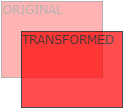
Move your mouse over the following elements to see the conversion effects of2D and 3D:
2D conversion
3D conversion
8.10.3. Browser support 
The number in the table represents the first browser version number that supports the property.
The number immediately before-webkit-,-ms- or-moz- is the first browser version number that supports the prefix attribute.
Attribute | ||||||||||||||||||||||||||||||||||||||
|---|---|---|---|---|---|---|---|---|---|---|---|---|---|---|---|---|---|---|---|---|---|---|---|---|---|---|---|---|---|---|---|---|---|---|---|---|---|---|
Transform | 36 | 10 | 16 | 3.2-webkit- | 23 | |||||||||||||||||||||||||||||||||
4.0-webkit- | 9.0-ms- | 3.5 -moz- | 15.0-webkit- | |||||||||||||||||||||||||||||||||||
12.1 | ||||||||||||||||||||||||||||||||||||||
10.5-o- | ||||||||||||||||||||||||||||||||||||||
Transform-origin | 36 | 10 | 16 | 3.2-webkit- | 23 | |||||||||||||||||||||||||||||||||
(two-value syntax) | 4.0-webkit- | 9.0-ms- | 3.5 -moz- | 15.0-webkit- | ||||||||||||||||||||||||||||||||||
12.1 | ||||||||||||||||||||||||||||||||||||||
10.5-o- Internet Explorer 10, Firefox, and Opera support the transform attribute. Chrome and Safari require a prefix-webkit- version. Note: Internet Explorer 9 requires a prefix-ms- version. In this chapter you will learn about 2D transformation methods: You will learn about 3D conversion in the next chapter. Example Example Example Example Scale (2) the transition width is 2 times its original size and its height is 3 times its original size. Contains two parameter values that represent the angle of tilt on the X and Y axes, respectively. If the second parameter is empty, the default is 0, and a negative parameter indicates a tilt in the opposite direction. Example Example Utilization All the transformation attributes are listed below: Property Description CSS Transform Elements suitable for 2D or 3D conversion 3 Transform-origin Allows you to change the location of the converted element 3 Function Description Matrix (npendium, npendium, pyrrine, n) Define a 2D transformation, using a matrix of six values. Translate (XBI y) Define a 2D transformation to move elements along the X and Y axes. TranslateX (n) Define a 2D transformation to move elements along the X axis. TranslateY (n) Define a 2D transformation to move the element along the Y axis. Scale (XBI y) Define a 2D scaling transformation to change the width and height of the element. ScaleX (n) Define a 2D scaling transformation to change the width of the element. ScaleY (n) Define a 2D scaling transformation to change the height of the element. Rotate (angle) Define 2D rotation and specify the angle in the parameters. Skew (xripangle.ymurangle) Defines a 2D tilt transformation along the X and Y axes. SkewX (angle) Define a 2D tilt transformation along the X axis. SkewY (angle) Defines a 2D tilt transformation along the Y axis. Principles, Technologies, and Methods of Geographic Information Systems 102 In recent years, Geographic Information Systems (GIS) have undergone rapid development in both theoretical and practical dimensions. GIS has been widely applied for modeling and decision-making support across various fields such as urban management, regional planning, and environmental remediation, establishing geographic information as a vital component of the information era. The introduction of the “Digital Earth” concept has further accelerated the advancement of GIS, which serves as its technical foundation. Concurrently, scholars have been dedicated to theoretical research in areas like spatial cognition, spatial data uncertainty, and the formalization of spatial relationships. This reflects the dual nature of GIS as both an applied technology and an academic discipline, with the two aspects forming a mutually reinforcing cycle of progress. |