In the previous chapter, we learned that Bootstrap needs a container elementto wrap the content of the site.
We can use the following two container classes:
.containerclass is used for containers that are fixed in width and support a responsive layout..container-fluidclass is used for containers that are 100% wide and occupy all viewports (viewport).
Note: the width (max-width) will be enlarged or reduced in proportion to thewidth of the screen. Super small screen < 576px Small screen ≥ 576px Medium screen ≥ 768px Large screen ≥ 992px Large screen ≥ 1200px Super large screen ≥ 1400px Max-width 100% 540px 720px 960px 1140px 1320px In the following example, we can try to resize the browser window to see that the container width varies between different screens: Note: the ≥ 1400px is a new addition to Bootstrap 5, and the largest Bootstrap 4 is the ≥ 1200px. By default, containers are filled with left and right margins, and there areno filled margins at the top and bottom. Bootstrap provides some spacing classes to fill margins. such as Bootstrap also provides some border (border) and color (bg-dark, bg-primary,and so on) classes to style the container: We will explain these styles in detail in later chapters. You can use The value of the max-width property of the container changes according to the size of the screen. Class Super small screen < 576px Small screen ≥ 576px Medium screen ≥ 768px Large screen ≥ 992px Large screen ≥ 1200px Super large screen ≥ 1400px 100% 540px 720px 960px 1140px 1320px 100% 100% 720px 960px 1140px 1320px 100% 100% 100% 960px 1140px 1320px 100% 100% 100% 100% 1140px 1320px 100% 100% 100% 100% 100% 1320px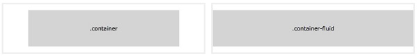
7.3.1. Fixed width 
.container
class is used to create a responsive page with a fixed width.Bootstrap5
.container
example ¶ <div class="container">
<h1>My first Bootstrap page</h1>
<p>These are some texts.</p>
</div>
7.3.2. 100% width 
.container-fluid
class is used to create a full-screen container that always spans the entire screen width (width is always 100%):Bootstrap5. Container-fluid instance 
<div class="container-fluid">
  <h1>My first Bootstrap page</h1>
  <p>Used. container fluid, 100% width, occupying all viewport containers.</p>
</div>
7.3.3. Inner margin of container 
.pt-5
is used to fill the inside margin at the top:Bootstrap5 instance 
<div class="container pt-5"></div>
7.3.4. The border and color of the container 
Bootstrap5 instance 
<div class="container p-5 my-5 border"></div>
<div class="container p-5 my-5 bg-dark text-white"></div>
<div class="container p-5 my-5 bg-primary text-white"></div>
7.3.5. Responsive container 
.container-sm|md|lg|xl
class to create a responsive container.
.container-sm
.container-md
.container-lg
.container-xl
.container-xxl
Bootstrap5 instance 
<div class="container-sm">.container-sm</div>
<div class="container-md">.container-md</div>
<div class="container-lg">.container-lg</div>
<div class="container-xl">.container-xl</div>
<div class="container-xxl">.container-xxl</div>