
The progress bar shows the completion of the user’s task.
The steps to create a basic progress bar are as follows
Add a file with a
.progressanalogous<div>.And then, up there,
<div>inside, add a file with class.progress-baris empty.<div>.Object with a width expressed as a percentage
styleproperties, such asstyle="width:70%"indicates that the progress bar is at 70% of the position.
7.14.1. Example 
<div class="progress">
  <div class="progress-bar" style="width:70%"></div>
</div>
Progress bar height 
The progress bar height defaults to 16px. We can use CSS’s
height
property to modify him:
7.14.2. Example 
<div class="progress" style="height:20px;">
  <div class="progress-bar" style="width:40%;"></div>
</div>
Progress bar label 
You can add text to the progress bar, such as the percentage of progress:
7.14.3. Example 
<div class="progress">
  <div class="progress-bar" style="width:70%">70%</div>
</div>
Progress bars of different colors 
By default, the progress bar is blue, and Bootstrap5 also provides progress bars in the following colors:
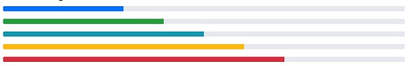
7.14.4. Example 
<div class="progress">
  <div class="progress-bar bg-success" style="width:40%"></div>
</div>

<div class="progress">
  <div class="progress-bar bg-info" style="width:50%"></div>
</div>

<div class="progress">
  <div class="progress-bar bg-warning" style="width:60%"></div>
</div>

<div class="progress">
  <div class="progress-bar bg-danger" style="width:70%"></div>
</div>
Striped progress bar 
Can be used
.progress-bar-striped
class to set the stripe progress bar
7.14.5. Example 
<div class="progress">
  <div class="progress-bar progress-bar-striped" style="width:40%"></div>
</div>
Animation progress bar 
Use
.progress-bar-animated
class to add animation to the progress bar:
7.14.6. Example 
<div class="progress-bar progress-bar-striped progress-bar-animated" style="width: 40%"></div>
Mixed color progress bar 
The progress bar can set a variety of colors:
7.14.7. Example 
<div class="progress">
  <div class="progress-bar bg-success" style="width:40%">
    Free Space
  </div>
  <div class="progress-bar bg-warning" style="width:10%">
    Warning
  </div>
  <div class="progress-bar bg-danger" style="width:20%">
    Danger
  </div>
</div>